
Letter late than never
- petehaestier
- May 16, 2022
- 2 min read
After some epic travels in March and April (you will some the output over the coming weeks), it's now time to re-start the blog. For reasons known only to me - and too dull to explain - this entry is slightly out of sequence, so here we go!
"Birders, as it turns out, have a lot in common with type geeks. They are cute observers of course, but they are also preoccupied with identification, classification, anatomy and minute details that distinguish the different breeds.
The ordinary stuff that surrounds us is often considered mundane, but is actually full of variety, and intrigue, and clues that shed light on our environment and ourselves." — Stephen Coles
I have somewhat of a liking for typography. The thought, time and money that goes into a company's brand and visual identity - so often unnoticed and consigned to the subliminal -
Easy to take from granted, but companies and brand spend millions getting it right so I made a special to hunt out some examples that stood out to me.
Week Ten - Typography

Location 1 - Regola, Rome
"Al Forno", meaning 'from the oven' is a sign spotted frequently in Rome. This refers to food cooked in a brick oven fuelled by wood. Amazing breads, pizza's and baked pastas (lasagne etc) are to be found within and reward the curious.

Location 2 - Antico Forno Roscioli, Rome
One such place is Antico Forno Roscioli. Along with an amazing selection of cakes and breads was some of the best (and cheapest) pizza I've ever eaten. And as we now from a previous blog, I love a bit of neon too - so this hit all the spots. If you are in Rome, definitely make a stop here. There is a restaurant around the corner by the same owners too.
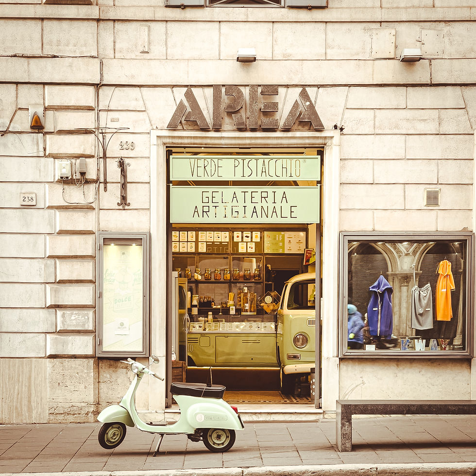
Location 3 - Verde Pistacchio, Rome
Gelato, a vintage moped and VW van, some amazing typography and branding - what's not to love?
An Instagrammer's delight too, no doubt. The gelato was outstanding (a scoop of Stracciatella and a scoop of Dark Cherry since you asked). I cannot recommend this spot enough.
In Summary:
I wonder if I can make a career out of this? Photographing great eateries with great typography? Enough said...
Next Time: Sunrise
The opening quotation is taken from The Field Guide to Typography by Peter Dawson [Thames and Hudson, 2013]


If anyone can earn a crust from eating and taking pics it would be you, great pics as always I don’t know how you do it but I’m glad that you do otherwise I’d have no holiday photos 🤣